Gentse Gidsen is a Ghent-based association of nearly 100 certified multilingual tour guides, founded in 1926. I designed a new logo to help them shed an outdated image and present themselves as the professional, established organisation they are.

/
Challenge
(01)
A Ghent institution, ready for a modern identity.
Gentse Gidsen has been active since 1926 and holds a strong reputation in the city. But the brand had not kept pace. The brief was clear: lose the dated image, gain something professional and internationally recognisable. The new logo had to feel trustworthy and expert, with a clear visual link to Ghent, without leaning on clichés or looking like every other tour guide organisation in Belgium.
The client was a committee with different opinions on colour, style and direction. Navigating that while still delivering a focused result was part of the challenge.


/
Solution
(02)
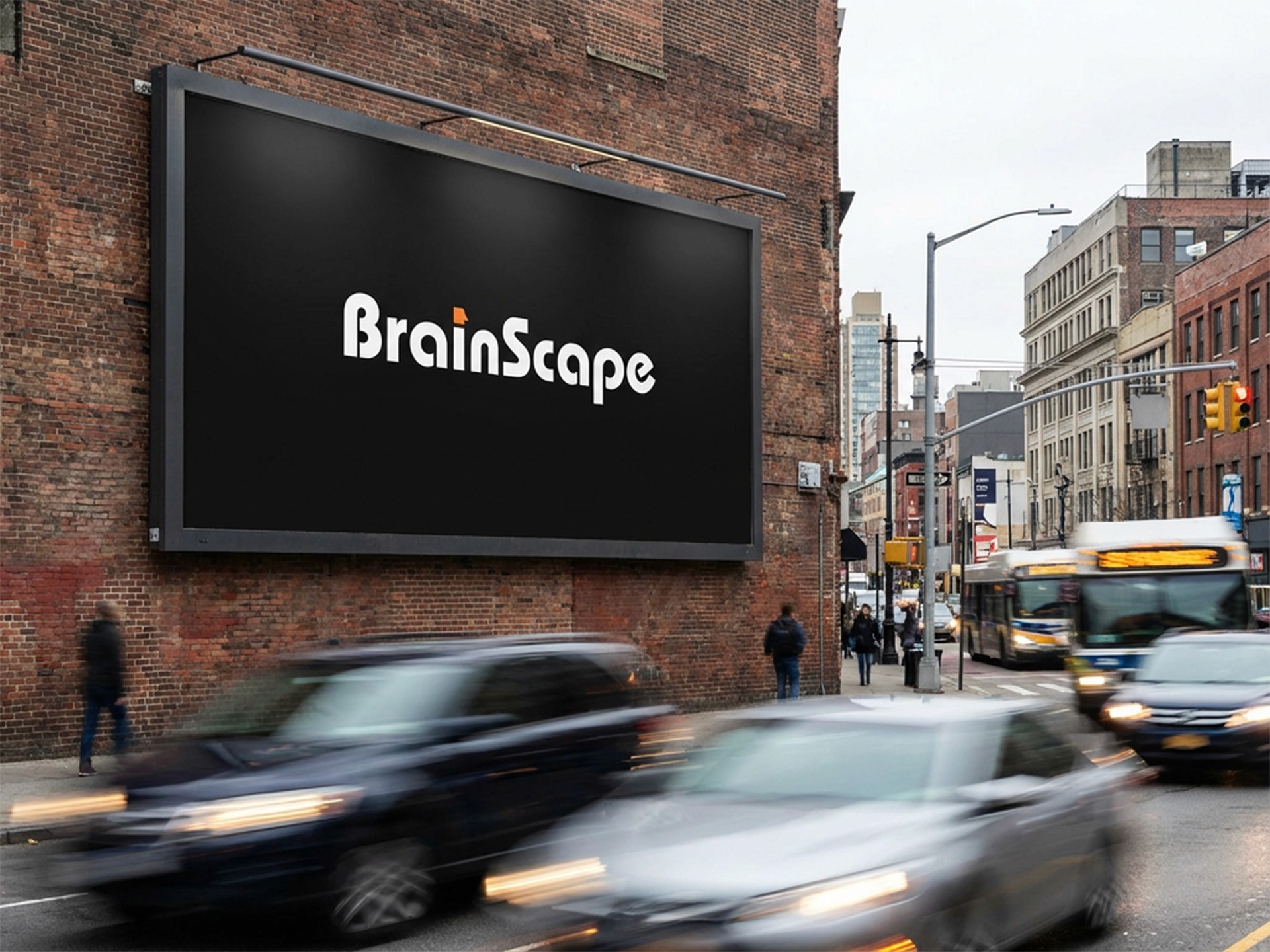
Ghent's skyline, made into a mark.
I developed multiple logo concepts, all built around the four iconic towers of Ghent: Sint-Baafs, the Belfort, Sint-Niklaas and the Boekentoren. The silhouette of the city was the one element everyone agreed on from the start.
The concepts varied in approach. My personal favourite was a bold, filled silhouette against a strong navy blue circle. Structured, confident and immediately recognisable at any size. The client chose a different direction: a clean line art version in a lighter blue, more open and approachable in feel.
It was not my first choice, but that is part of the job. Design is subjective, and the client knows their audience. What matters is that the chosen logo was a genuine step forward from what they had before.


/
Conclusion
(03)
A good reminder of what design really is.
Gentse Gidsen is a project I think back on when clients ask whether I have a favourite version of a logo. I do. They picked a different one. And it still works well for them. That tension between personal preference and client fit is something every designer navigates.
What made this project extra interesting was the number of people involved. Gentse Gidsen is run by a committee, which means multiple stakeholders with different opinions on colour, typography and direction. Getting everyone to land on the same choice takes more than good design. It takes listening carefully, presenting options clearly and knowing when to let go of your own preference. That is a skill in itself.


Latest Projects.
© Kanso Studio
A curated selection of projects that reflect our commitment to simplicity and purposeful design.