Het Koetshuis is a Belgian brasserie housed in a historic building on Domein de Renesse, built in 1841. After a change of ownership, the place needed a completely fresh start. As part of the creative team at XXLSIGN in Westmalle, I built the full brand from scratch: strategy, visual identity, website and an ongoing online marketing plan.

/
Challenge
(01)
A historic place, reborn under new ownership.
Het Koetshuis has been part of Domein de Renesse since 1841. After years as a brasserie under different owners, the new owner Kristof took over following a bankruptcy and wanted to reopen with a clear vision: a warm, accessible meeting place where everyone is welcome. Young and old, locals and day trippers, people with muddy boots after a walk or colleagues meeting for lunch. No pretension, no barriers.
The previous identity had nothing to do with that vision. There was no brand to build on. Everything had to start from zero.


/
Solution
(02)
Built from the ground up.
Branding
I started with a full brand strategy. Together with Kristof I mapped out the mission, vision, core values and target audience. Five brand values came out of that process: hospitable, warm, accessible, reliable and rooted. From there I developed the complete visual identity.
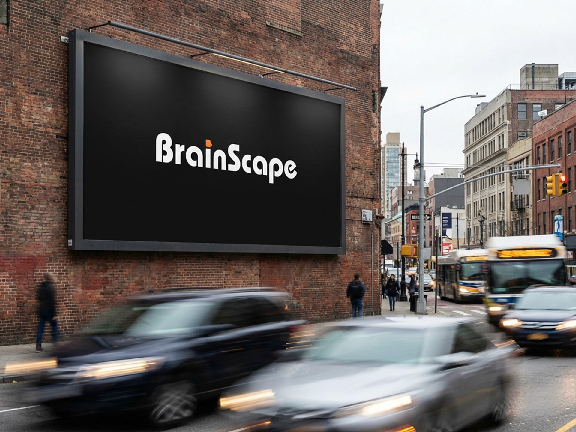
The logo is built around the silhouette of the building itself, the distinctive stepped gable that is instantly recognisable to anyone who knows the place. The logo comes in multiple variants, primary, secondary and icon only, each in both light and dark versions for consistent use across all applications.
One of the core challenges was finding the right balance between rustic, classic and modern. Those three directions can easily pull against each other. The solution was in the details. Typography pairs Anton, a bold condensed display face, with Libre Baskerville for body text. The contrast between the two captures exactly that tension: modern structure with a warm, timeless finish. The colour palette reinforces it. Warm sand, broken white, terracotta red, earthy gold and deep brown. Nothing that shouts, everything that feels like it belongs in a park and in a building with 180 years of history behind it. A repeating pattern derived from the stepped gable was developed as a supporting graphic element, used across menus, packaging and other branded touchpoints. The full identity was documented in a detailed brandbook covering every guideline for consistent application.
Beyond the core identity, I also took care of the graphic design work: the menu and headed stationery, both built around the new visual language. A signage board for the car park is currently in production.
Website
The website was set up with one clear goal: generating reservations. I focused on SEO and GEO optimisation to make Het Koetshuis findable for people searching for a restaurant in the area. An events page was added to capture additional search traffic from activities on Domein de Renesse, while also positioning Het Koetshuis as the natural stopping point for visitors to the park.
Google My Business was fully updated after the ownership transfer, including removing the previous owner, updating all contact details, linking the new website and switching the status from permanently closed to temporarily closed ahead of the reopening.
Online Marketing
The social media strategy is built around four content pillars: the location and its surroundings across the seasons, the kitchen and craftsmanship, community and familiar faces, and seasonal dishes or events worth booking for. Facebook reaches the local 30-plus audience. Instagram focuses on atmosphere and experience.
An opening email campaign was prepared for the existing database, introducing Kristof, sharing the vision and inviting people to visit after the renovation. Paid advertising on Google and Meta is planned as a next step once the organic channels are established.


/
Conclusion
(03)
When branding has to do the heavy lifting.
Het Koetshuis is the kind of project where the brand really matters. The building has history, the food is honest and the hospitality is genuine. But none of that lands if the visual identity does not reflect it. A logo that references the actual architecture, a colour palette drawn from the park, a brandbook that gives the whole team a clear framework to work from. That consistency is what turns a reopening into a fresh start people actually believe in. This project was realised under my employer XXLSIGN, where I had the opportunity to take full creative ownership from strategy to delivery.
Latest Projects.
© Kanso Studio
A curated selection of projects that reflect our commitment to simplicity and purposeful design.